In today’s digital landscape, the placement of ads on your website not only affects user experience but also directly influences ad performance metrics like visibility and click-through rates (CTR). Properly positioned ads can enhance the effectiveness of your advertising efforts and boost revenue without compromising the aesthetics or usability of your site. This guide explores the standard ad placements for various ad formats on both web and mobile platforms, offering insights into why these positions work best.
Leaderboard
Leaderboard ads, with their significant width and strategic placement, are typically positioned at the top or bottom of web pages. On desktop sites, placing a leaderboard ad in the header ensures it is one of the first elements seen by users, capturing attention immediately upon page entry. Alternatively, positioning it at the footer can capture users’ attention as they complete their browsing of the page, offering a final engagement point.

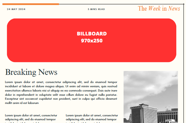
Billboard
The large format of billboard ads is best utilized at the top of webpages, especially above the main content or navigation bar. This placement makes use of the prime real estate to capture user attention with high-impact visuals right when the page loads, making it highly effective for branding campaigns.
Skyscraper
Skyscraper ads are designed to stand tall in the sidebars of webpages. Their vertical orientation makes them ideal companions to the main content area, especially on news sites, blogs, or e-commerce platforms where they can remain visible as users scroll through content, thereby increasing engagement opportunities.

Rectangle
Rectangle ads fit naturally within content feeds or between paragraphs of articles, where they can attract attention without disrupting the reading flow. Their placement in sidebars also works effectively, making them versatile for various content layouts.

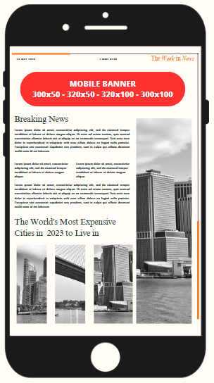
Mobile Banner
On mobile devices, banners are best placed at the top or bottom of the screen. This positioning allows for optimal visibility without interfering with content navigation. As mobile users typically expect ads in these areas, they are less likely to be viewed as intrusive.
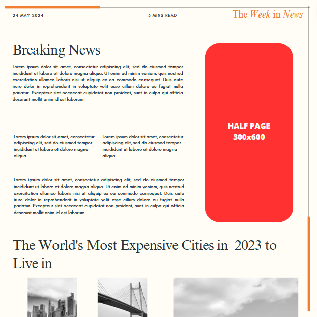
Half Page
Half page ads are large enough to command attention and are best placed in sidebars where they can provide a rich content experience without overshadowing the main article. They are particularly effective on desktop views where the sidebar space is ample.
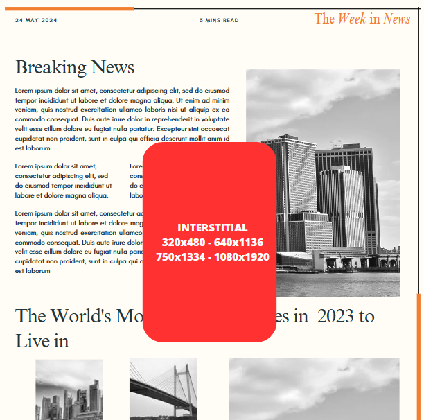
Interstitial
Interstitial ads cover the entire screen and are ideally used during natural breaks or transitions in content, such as between game levels or before a video plays. This timing reduces perceived intrusiveness while maximizing viewer engagement.
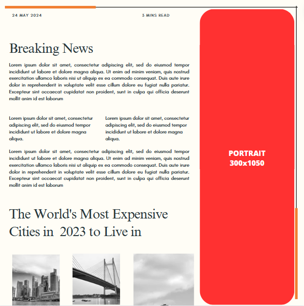
Portrait
Portrait ads should be placed in sidebars alongside long-form content. Their extended vertical format allows them to deliver impactful visuals that engage users without requiring a shift in reading or viewing orientation.
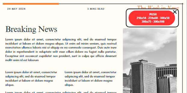
Push
Push ads, also known as pushdown ads, dynamically expand from a smaller initial size to a larger format, engaging users without preempting their content experience. Ideal for high-traffic areas of a website such as the main content block or just below the navigation menu, Push ads activate either upon user interaction or automatically based on set triggers. This ad format is particularly effective in capturing user attention through its animation and expansion, offering advertisers a compelling way to present more detailed messages or interactive content. Placing Push ads in areas where users are likely to read or interact ensures maximum visibility and engagement.
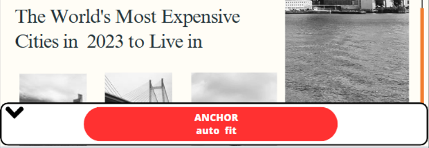
Anchor
Anchor ads are designed to maintain a consistent presence on the screen by anchoring to either the top or bottom of the browser window. These ads are particularly useful on both desktop and mobile formats where continuous visibility is desired without significantly disrupting the user experience. Due to their persistent nature, Anchor ads are best placed in areas of the website where they can remain visible as users scroll, such as along the lower edge of the screen on a news feed or social media platform. This placement strategy leverages the ad’s stability to ensure ongoing exposure while providing the option for users to engage with the ad at their convenience.
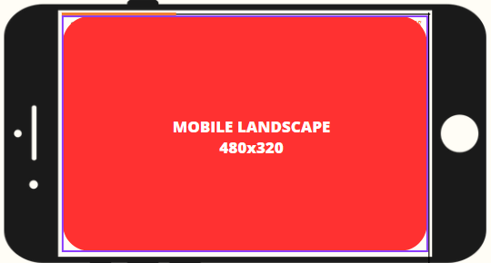
Mobile Landscape
Mobile Landscape ads are tailored for devices used primarily in landscape orientation, such as tablets or mobile phones during media playback. These ads take advantage of the wider landscape format to deliver richer content that can include text, interactive elements, or video, making them ideal for gaming apps or video content platforms. Effective placement for Mobile Landscape ads includes transitional scenes in games or before video content, where they can utilize the full attention of the user without obstructing gameplay or viewing experience.
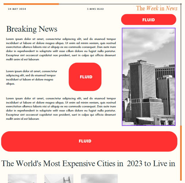
Fluid
Fluid ads are uniquely designed to adapt to the space they are given, making them exceptionally suited for responsive websites. These ads automatically adjust their width and height to fit different screen sizes and orientations, ensuring optimal display and interaction across all devices. The placement of Fluid ads should be in versatile content areas that change dynamically, such as between blog posts or news articles, where they can seamlessly integrate without disrupting the layout. This adaptability not only enhances the user experience but also maintains the aesthetic integrity of the website or app.
Conclusions
Choosing the right ad placements on your website involves understanding both the functionality of the ad format and the behavior of your audience. By strategically positioning ads where they can perform best, you not only enhance user engagement but also drive better revenue from your digital spaces.


